Saturday, September 22, 2012

Upper East Side Galleries

Eleven year old Alan and his two former public school teachers and I recently visited two galleries on the Upper East Side together.


My guests had never been to an art gallery before so I felt it necessary to define for them what the function of a gallery is. I proceeded to tell them that like a museum, a gallery is place to see works of art, such as paintings, drawings, photographs, installations, and/or sculptures. The primary difference between a museum and a gallery, however, is that galleries do not charge an entry fee. There are hundreds of galleries in New York City, all with their own areas of interest and specialties. They put together exhibitions (also known as shows) that usually last for several weeks or for several months. These exhibitions can consist of one artist's work (a solo exhibition/show), or many different artists works displayed at the same time (a group exhibition/show).


Our first stop was to L&M Arts, a gallery on East 78th street that showcases modern and contemporary art. There, we saw a solo- exhibition of works by George Segal (1924- 2000), a 20th century American sculptor. Segal created larger than life sized human forms performing commonplace, easily recognizable activities. We saw a group of figures riding the bus, sitting on a bench, and walking in an intersection. The white plaster forms were seemingly anonymous. The lack of color and absence of detailed facial features made it apparent that these figures could be any one of us. There was no attempt made by the artist to depict age or to glamorize his subjects. Rather, he represented the average person.


We then visited Michelle Rosenfeld gallery, on East 79th street. Here, we viewed the work of two Asian contemporary artists. First we saw a mixed media piece titled Aggregation 06-AU037 by the Korean artist Kwang Young Chun (b. 1944). Mixed media refers to a piece of art that is created using more than one material. In Aggregation, the primary material that Chun used was paper from discarded Korean books that he found. I made the claim that to me, his work looks like sculpture on the wall- another word for this is a wall relief. Although it is mounted on the wall like a painting, its elements project off the canvas and out into the viewer’s space.


Afterwards we saw a painting titled Eye Ball White, 2001 (acrylic on canvas mounted on wood) by Japanese artist Takashi Murakami. Many people would describe Murakami’s art as cartoon-like and find it amusing. His works are very popular- museums and galleries all over the world have given Murakami solo exhibitions and often include him in group shows. Murakami paints in his own unique style, which has been coined by the term Superflat. Paintings in the Superflat method are composed of cartoon like characters that are superimposed on flat color backgrounds. The artist intentionally took familiar images from Japanese TV animation and removed them from their typical pop-culture context. We discussed how the center eye- ball in Eye Ball White appears three- dimensional. We decided that Murakami achieved this effect by painting each eye not only a different size, but also at different angles, with some receding into space and some projecting forward.

To see examples of the artists work mentioned in this post, visit the websites below
http://www.artcyclopedia.com/gallery/segal_george.html
http://www.lmgallery.com/exhibitions/george-segal/
http://www.artnet.com/artist/425130245/chun-kwang-young.html
http://www.takashimurakami.com/

Saturday, September 8, 2012

A Visit to the Guggenheim


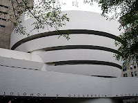
Today I went to the Guggenheim with Paul, a new friend. I met Paul at NoHo Gallery as I prepared for my last tour. We talked about our mutual love for the arts and decided to see an exhibit together. Paul just left the US to return to his native Amsterdam. He worked at NoHo as part of an internship through his college, where he is majoring in Museology, the study of the organization, management, and function of a museum.


At the Guggenheim we saw a show titled Haunted, comprised of contemporary photography and video installations from a range of artists. Many of the participants are well established and widely recognized, while others are just emerging onto the art scene.


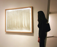
Two pieces really spoke to me. The first, titled Curtain, 2004, was executed by a German artist named Markus Hansen (b. 1963). He created the work out of dust, varnish and breath on glass. That's right- BREATH on glass! I have never seen anything fabricated out of that mixture of materials. When looking at the work from a distance, all you see is a translucent, soft beige curtain. Upon closer inspection, however, you are able to detect two sheer layers of fabric that almost appear three-dimensional. You want to poke the glass as if to feel the material. It was incredibly well rendered. The Young Collectors Council at the museum purchased the piece for the Guggenheim collection in 2004.


I was also really drawn to a series by artist Sarah Charlesworth (b. 1947), a native of New Jersey. Her work, titled Herald Tribune: November 1977 is comprised of 26 prints, where each print is a different page and different consecutive date in November from the year 1977. Interestingly, though, the artist has removed the body of the text from the paper, and left the viewer with everything else, which includes images and the paper details (the title, date, edition, weather, etc.). Like Hansen's Curtain, I had never seen anything like it. I couldn't help but ask myself "who would think to do such a thing - she photographed already "printed" paper, and created a work of art from the layout and images alone." I was truly impressed with her originality.


For more information on Haunted, visit the following link:
http://web.guggenheim.org/exhibitions/exhibition_pages/haunted/#/overview

Saturday, July 7, 2012

The Jewish Museum- After Hours


Going to a museum once its doors are closed to the public is a truly special experience. You don't have to fight through crowds to see the works and you feel as if the show is there for only you to see. It makes it hard to go back to a museum during regular hours!


The museum is currently hosting a child-friendly, whimsical exhibition called Curious George Saves the Day: The Art of Margret and H.A. Rey. As soon as you enter the show, you feel as if you are among one of the pages of a Curious George book, as it features over 80 original drawings from the series. Interestingly, Curious George is not simply about a monkey and his tenacious attitude and quirky adventures. Through an illustrated timeline, the exhibition tells the story of the lives of the books creators and the struggles they endured prior to creating their memorable fictitious characters.


One of the nice interactive features is that there is a reading corner for children to peruse through copies of the books, both to see the illustrations and to visit a familiar friend.


For more information about the show visit the following links:
http://www.thejewishmuseum.org/exhibitions/curiousgeorge
http://www.thejewishmuseum.org/curiousgeorgetimeline/

Saturday, June 30, 2012

Campus architecture continued

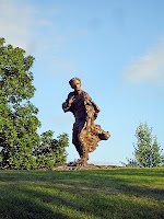
Towards the end of June, I returned to my alma mater, Brandeis University. It could not be more different from Duke University if it tried. Brandeis, founded in 1948 by Justice Louis D. Brandeis, is among the country’s youngest universities. Therefore, it should come as no surprise that its architecture is a reflection of its times. The campus today, however, hardly resembles the Brandeis from the 50s. It has truly morphed from a grid of homogenized, brick, low-rise structures to a Mecca of architectural bravura. As I mentioned in my discussion of Duke, the Brandeis campus faced a similar conundrum upon its recent renovations. It took a bold approach to change in erecting new facilities in a completely avant-garde style. No conscious effort was made to blend these new buildings into their existing surroundings, but rather, they are purposefully bold and use cutting edge materials. One such example is called the Shapiro Campus Center, known by students as “The Big Green Monster.” When it opened in 2004, it caused a fairly pervasive uproar. Everyone you asked had an opinion, and it was usually negative. People hated the color (patinated copper), the scale, and the fact that it didn’t blend in. But it shortly became the nucleus of the campus, and steadily thereafter more buildings in a similarly contemporary style began to emerge throughout the university (dormitories, academic buildings, the admissions center, etc.). Immediately upon my return I toured the new science complex. It is a true architectural marvel situated on the highest point of campus, which lends for incredible views of the sports fields in the foreground and the city of Boston in the backdrop. It links to the existing complex, but a clear line has been drawn between old versus new (this clearly reads as intentional). Many features of the campus remain the same, such as student dormitories, the Rose Art Museum, classroom buildings, and chapels, but it is overtly obvious that Brandeis has entered into the 21st century, and its brave and striking architectural commissions helped lead the way.

Images: Statue of Louis D. Brandeis, the Rose Art Museum, Shapiro Campus Center, The Village Dormitory, two views of the new Science Complex


Wednesday, June 27, 2012

Walking tour

Being a native New Yorker, it still amazes me how much I feel like a tourist while in that part of Lower Manhattan. I find it difficult not to trip on the cobble- stones while gazing up at the glass- fronted skyscrapers (a definite irony). What really strikes me about the area is just how much of an architectural Mecca it actually is. Within a few block radius, one can see such a diverse range of historical styles:

Neoclassical:
The Stock Exchange, probably the most iconic structure in the area, is fabricated in the Late Neoclassical style, which is reminiscent of ancient Greek construction. It employs all of the significant features of a Greek temple – namely an arched pediment with figures and a colonnade of Corinthian ordered columns. These are the most ornate type of column where the uppermost section is decorated with acanthus leaves and scrolls.

Art Deco:
Art Deco details can be found in many office buildings in the area. This style originated in Paris at the turn of the 20th century, specifically in the 1920s. Just as Deco pervaded women’s fashion and home appliances, it found its way into fine and decorative arts and architecture. Above all else, it celebrated symmetry and repetition, and is characterized by its unique materials, most notably certain types of metals (for example, aluminum and stainless steel), wood and animal skin. A stylistic trademark of Deco is the stepped back pattern and geometric use of line – chevron patterns, the ziggurat and the sunburst are traditional Deco motifs. For its use of material and pattern, the apex of the Chrysler Building in New York City is the epitome of Deco.

Gothic Revival:
Usually when someone thinks about Gothic architecture, the image of a cathedral might appear in his or her head, for example, Westminster Abbey in England or Notre-Dame in Paris. But Europe isn’t the only place where you can see this style of architecture. Take Wall Street’s Trinity Church, one of the oldest churches in the United States (that is still operating today). The Church has been rebuilt three times since 1698, but architectural historians consider the present building, designed by architect Richard Upjohn and erected in 1846, a classic example of the Gothic Revival style. It possesses all of the traditional Gothic architectural elements. To name a few, we see a prominent rose window on the façade, stained glass windows, stone figurines/sculptures of saints/bishops (called Jamb Statuary), and probably most notably is the dramatic and monumental pointed roof.

Glass skyscrapers:
Nothing could be more different from Gothic Revival architecture than an all glass skyscraper. And the best thing about being down near Wall Street is that you can see one style within an eye-shot of the other. Not surprisingly, synonymous to the term ‘skyscraper’ is the word ‘height.’ Even if someone knows nothing about the history or construction of skyscrapers, they know they are tall. By definition, a skyscraper affects its surroundings in a monumental way. Quite literally, they change the skyline of the city in which they are apart. Toward the end of the 19th century, skyscrapers sprouted up in Chicago, London, and New York. After the 1930s, they became a world- wide phenomenon, and the desire to make them bigger and sexier still exists today. Their structural core set skyscrapers apart from buildings that came before them, which were fabricated from masonry. Steel skeletons and now reinforced concrete make skyscrapers possible. Some of the most infamous skyscrapers are known for their use of curtain walls, or in other terms, windows. Probably the most unique skyscrapers today use floor to ceiling glass windows, where the internal structure is concealed by an impression that the entire building is composed of glass.


Image list:
1) Cobble stone street- what Wall Street is still known for
2) Stock Exchange
3) Deco building detail
4) Trinity Church
5) Glass skyscraper


Saturday, June 2, 2012

NYC Art Tours goes to NC


NYC Art Tours doesn’t just stay in NYC! Wherever I travel, viewing art and architecture surely makes its way into my itinerary. Over Memorial Day weekend I headed down south to North Carolina. There, I saw many charming sites, including local antique stores and art galleries. I also had the opportunity to visit the campus of Duke University.

Having studied architectural history extensively as an undergraduate at Brandeis University, I wanted to blog about Duke’s neo-Gothic architecture (also known as the Gothic Revival style). I see this as a two- part post. Here, I will talk about the architecture at Duke. Next week, I will be returning to my alma mater for my five year reunion. Since I last spent time on the Brandeis campus, its architectural landscape has evolved enormously. I am excited to record these changes and discuss its structures in my second architecture post.


Whether large or intimate, rural or urban, all colleges and universities possess the commonality of practical elements such as residence halls, classroom buildings, and cafeterias, as well as such entities as a student center(s), a gymnasium, a chapel(s) and a gallery or museum. These features are presented in various architectural styles according to the desires of the specific campus in which they are placed. Duke and Brandeis, for instance, could not be more architecturally different from one another, yet they are both examples of college campuses that possess strong architectural identities.


Duke is perhaps most well known for its Chapel, which, according to the school’s website, is known as the “university’s iconic center.” As I learned from reading about the Chapel’s history, it was constructed between 1930 and 1935 by architect Julian Abele of the Philadelphia firm Horace Trumbauer. The site mentions that Abele was America’s first notable black architect, who went on to have an illustrious career; however, it was not his hand alone that executed the elaborate project. The stone and wood carving, statues, ironwork and stained glass were completed by various skilled artisans, many of whom were based out of New York and traveled to Durham to work on site. While the Chapel pays homage to English cathedrals as well as American examples, it is its own unique form. When one approaches the Chapel, it is clear that you are in the presence of architectural greatness. It possesses key Gothic elements, such as a pointed arch, intricate stonework and stained glass. From afar and up close, it is strikingly majestic and detailed. My pictures do not do it justice. The Gothic style can be seen across American universities. In fact, it was so popular that the term Collegiate Gothic has since been coined. In addition to Duke University, one can see Gothic architectural examples on the campus of Yale University, Boston College, Cornell University and the University of Chicago, to name only a few.


In addition to the Duke Chapel, I was able to see the campus art museum, which I will contrast with the Rose Art Museum at Brandeis in my next post. I also wanted to point out one additional building, whose function I am unsure of (if I had to guess, it looked like a classroom building). I noticed it immediately, because it lent itself well to am interesting architectural debate that my late and renown architectural history professor Gerald Bernstein frequently addressed in his lectures. According to Professor Bernstein, when an architect is faced with a new commission on an existing architectural site, he or she can choose to go one of three ways. One- the architect may decide to recreate the original style using modern materials. Professor Bernstein always argued that this idea was foolish, because the copy would never appear authentic and it would not stand up to the original. Two- the architect may decide to create a link between the old and the new styles, acknowledging the past style while embracing the technology of the present. I would place this unknown classroom building into this category. It clearly borrows the iconic features of the Gothic style but does not attempt to recreate them verbatim. The third option is the most controversial- the architect decides to create something radically different from his original, thus creating an entirely new rhetoric in the existing space. This can be very successful if the building is well received. But it is often criticized for breaking up the overall flow and harmony of the existing area. Below are a few more shots of the Chapel. 


Thursday, May 31, 2012

Summer Associate Tour of Chelsea

As a departure from their daily lives of debriefing and reviewing cases, a group of summer law associates and partners and I went on an art tour of three Chelsea Galleries. We visited Gagosian Gallery, Pleiades Gallery and Axelle Fine Arts before heading to the High Line.

As many of my guests were from out of town, I began by discussing a bit about the history of Chelsea as a neighborhood. It is certainly an unusual part of town, where gas stations, warehouses and low-income housing projects stand side by side world famous art galleries, chic restaurants and multi-million dollar condos.


As we entered our first gallery, Gagosian, I gave a brief talk about the history of the gallery and asked that each person take in the dramatic surroundings before we even began to discuss the art - the ceilings must be at least 30 feet high. The space is absolutely incredible for viewing works of art. The pristine whitewashed walls housed an extraordinary show of still lifes by the American Pop artist Roy Lichtenstein. Unlike a typical gallery, where each piece of art on view is available for sale, Gagosian is known to showcase works that are on loan from private collections and from museums, and are therefore not a way for the gallery to make money, but rather for the public to simply enjoy. Before examining the works in depth, I defined the term still life for the group, as well as pointed out significant trademarks of Lichtenstein’s work, such as his use of Ben-Day dots, limited perspective, clean lines, and bold primary color. We then analyzed six pieces, including one drawing and one sculpture, focusing our discussion on elements such as materials used, technique, and overall aesthetics. I felt it necessary to define the word ‘homage’ to the group, as many of the Lichtenstein’s still lifes in fact ‘paid homage’ or referenced other artists, namely Pablo 

Picasso, Georges Braque, Henri Matisse, and Gustave Courbet to name only a few.

We then walked up the block to Pleiades Gallery, an artist run cooperative, to see an exhibition of artworks by the contemporary American artist Brian Kelly. I thought it would be a wonderful treat to be able to meet an artist on our tour, and to hear him talk about his works and career as an artist. Kelly spoke in great detail about his artistic process as well as his use of materials.

Our final destination was Axelle Fine Arts, across the street from Pleiades. At the time of our tour, Axelle had several exhibitions hung simultaneously; however, I chose to show the group several works by a French artist named Patrick Pietropoli who creates realistic and very architecturally savvy scenes of the NYC skyline. I thought the group would appreciate seeing painted architectural vistas before we walked to the High Line to see it firsthand.

Since its opening only one year ago, the High Line has hosted over 2 million visitors. As I told the tour, the High Line was originally constructed in the 1930s to lift dangerous freight trains off of Manhattan's streets. The newly constructed High Line runs through three of Manhattan's most dynamic neighborhoods: the Meatpacking District, West Chelsea, and Hell’s Kitchen. Originally, these neighborhoods were primarily used for industrial and transportation purposes. Now many of the warehouses and factories have been converted into art galleries, designer shops, fancy restaurants, and illustrious residences. Section 1 of the High Line (which spans from Gansevoort Street in the Meatpacking District to 20th street and 10th avenue) is open as a public park, owned by the City of New York and operated under the NYC Department of Parks and Recreation. Private funds have been raised for the park and overseeing its maintenance. It is also important to note that the High Line has recently made an effort to commission artists to create site- specific works of art on the highline, integrating their creations in some way to the surrounding space. It’s hard not to feel like you’re in the presence of greatness when you’re walking the High Line. The open vista, the physical structure, and the crowd make the experience entirely unique to New York, which was the perfect culmination to a terrific tour.